
The interface
What every control actually does, which ones get confused, and which ones spend tokens.
Mocky puts a great many controls on screen, and hardly any of them are labelled with a verb. That is deliberate — a canvas tool that spelled out what each button did would be a wall of text — but it leaves a gap this page fills: what each control actually does, which pairs of controls get confused with each other, and which ones spend tokens.
It is not a tour of the product. It assumes you can see the button; it tells you the part you cannot see.
How to read this page#
Every icon below is the real one, drawn from the same path data as the running
interface (src/ui/Icon.tsx). If a button in your window looks like the icon in
the table, it is that button.
Every label is quoted verbatim from src/i18n/en.ts and src/i18n/parts/*.ts.
The French interface is not a translation of the English one — both are written
— so if you run Mocky in French, read fr/interface.md instead of translating
back.
Cost is the last column of every table:
| Cost | Meaning |
|---|---|
| free | Nothing leaves the browser. A state toggle, a local computation, a file written from memory. |
| server | A round trip to the Mocky backend. No model, no tokens — but it needs the backend up. |
| model | Spends tokens. Every one of these is behind an explicit click; none of them ever fires on its own. |
| image | Calls the image provider. Slower and more expensive than a text call. |
There is a recap of every model control at the end of this page.
The main navigation#
The bar across the top of every route. Nothing here touches a project's contents; it is all navigation, theme and account.
| Control | What it does | Cost | |
|---|---|---|---|
| Mocky (wordmark) | Mocky home — back to the project list. | free | |
| Project name (breadcrumb) | Two different controls wearing one label. Away from a project, it is Back to the project. Inside the project, it turns into an input: Rename project. Enter or leaving the field commits, Escape cancels. | free | |
Home | The project list. | free | |
DESIGN.md | The full-page art-direction editor. | free | |
Media | The image library as a page rather than as a modal. | free | |
Settings | Provider, key, model — and Notification: Sound when a generation finishes, a short chime when a generation ends while Mocky is not the tab on screen (a lower one if it failed), with ✓ or ⚠ in the tab's title until you come back. Kept in this browser. | free | |
Admin | Only rendered when your account is an admin — and the route checks a second time, so a hand-typed URL lands on Admins only. rather than on the panel. | free | |
Docs | The only entry that is a real link: it opens https://mocky-docs.emanuelvigreux.fr in a new tab. The small arrow is what says so. | free | |
| Theme | Switch to the Paper theme / Switch to the Ink theme. The icon is the destination, not the current state: a sun means "go light", and it is shown while you are in the dark theme. | free | |
| Account | Signed in — click to sign out. It asks for confirmation first, and signing out leaves your projects on this device. | free | |
Sign in | Opens the sign-in modal. Sign in to keep your projects on every device. | free |
Leaving a project is not free of consequence, even though the button is.
Home, DESIGN.md, Media, Settings and Admin all unmount the project
view, and its cleanup aborts the generation in flight and every repair attempt
with it. If Mocky is mid-generation, that click cancels it.
The folded masthead#
Below md the row collapses to three controls: the sync indicator, the theme
toggle, and Navigation menu, which opens a sheet. The sheet replays
the same routes as 44-pixel rows, adds Docs as a link, and appends
Sign out to the account row — the one label the wide header does not show,
because there the account button is the sign-out button.
The projects page#
The header#
| Control | What it does | Cost | |
|---|---|---|---|
Search projects… | Filters on the project name and on every screen's name and prompt. A project you cannot name is findable by what you asked for inside it. Not rendered at all with five projects or fewer. | free | |
New folder | Opens the folder dialog. Hidden until at least one project has a screen. | free | |
Select / Done | Enters and leaves tick mode. Leaving it empties the selection. Hidden when there is only one project. | free | |
New project | Creates the project and opens it immediately. | free |
The selection bar#
Sticky, and only present in tick mode.
| Control | What it does | Cost | |
|---|---|---|---|
Tick all / Untick all | Ticks what is visible, not what exists. With a search active, the batch is the search result — which is how you delete "everything called draft" without ticking eleven boxes. | free | |
File | Opens the filing dialog for the ticked projects. Disabled with nothing ticked. | free | |
Delete | Two-line confirmation: the count of projects, then the count of screens they hold, when they hold any. Disabled with nothing ticked. | free |
The tick boxes themselves are drawn, with a real underneath. That is
not decoration for its own sake — a native checkbox paints the operating
system's accent colour, the one colour on the page the theme cannot reach.
Lead, index, drafts#
| Control | What it does | Cost | |
|---|---|---|---|
Open | Opens the project. | free | |
Delete project | One confirmation, naming the project. | free | |
| Lead thumbnail | Clickable, but deliberately not a button: it is a div, marked aria-hidden, because it duplicates the Open control beside it. A focusable element hidden from assistive technology is a defect, not a shortcut. | free | |
| Fold a section | Collapses a folder, or the Unfiled group. | free | |
Rename the folder | A browser prompt. Rendered only on a real folder — never on Unfiled, which is not a folder but the absence of one. | free | |
File “{name}” | Files that one project. | free | |
Clear all | Deletes every empty draft at once, behind a single confirmation. | free |
The two folder dialogs#
New folder asks for a name (Folder name, placeholder
Client, Drafts, To review…) and a list of projects to put in it.
Create the folder stays disabled until both are filled, because a folder
in Mocky is its projects: there is no record of an empty one to store.
File shows the existing folders as chips, offers a new-folder field, and adds
Take out of the folder — but only when at least one of the chosen projects is
currently filed, since otherwise the button would undo nothing.
The project toolbar#
Top-left of the canvas, and the densest thing in the product. Three defences
keep it on screen: labels fold away below md, everything past Modify folds
into More, and the row scrolls itself rather than pushing the page sideways.

- Back Leaves the project — and aborts a generation in flight.
- Link Pick an element in a screen and draw a cable to the screen it should open.
- Modify Click an element and describe a change, or edit its text directly.
- Interact Every preview becomes clickable at once.
- Annotate Snip a region of a screen into the composer as a numbered reference.
- Frame The iPhone frame around mobile screens. Greyed out when the project has none.
- System The live design system: your tokens, and a way to recolour them.
- Audit SEO and accessibility. Opening it evaluates nothing.
- Motion Ultra Cut a film from the media library.
- Demo Plays the prototype, in a device frame. See Demo mode.
- Export A runnable Vite + React + Tailwind project, as a
.zip.
The three that never fold#
| Control | What it does | Cost | |
|---|---|---|---|
Back | Leaves the project. As above: this aborts a generation in flight. | free | |
Link | Draw links between screens. Click an element inside a screen, then pick a destination. Turning it on turns Modify and Annotate off — and closes System or Audit, because the Links list it opens wants the same slot they do. | free | |
Modify | Click an element in a screen, then describe a change — no code needed. Also mutually exclusive with the other two. | free |
The exclusivity is the point: all three modes make a click inside a screen mean something different, and two of them at once would make a click mean nothing.
The eight behind "More"#
Rendered as buttons at md and above, as menu rows below it — from a single
list, so the two can never drift apart. More itself only exists
below md.
| Control | What it does | Cost | |
|---|---|---|---|
Interact | Make all screens interactive (clickable buttons, animations). Hands the pointer to every preview at once. | free | |
Annotate | Snip a region of a screen into the chat as a numbered reference. The rectangle you drag becomes a thumbnail attached to the composer, and it travels with your next prompt. | free | |
Frame | Show or hide the iPhone frame on mobile screens. Disabled when the project has no mobile screen — and the preference is not cleared with it, because it lives in one browser-wide key shared by every project. Disabling the control rather than resetting the setting is what keeps your other projects framed. | free | |
System | Live design system — your DESIGN.md tokens, and a way to recolor them. Closes Audit, or Link mode, if one was open. | free | |
Audit | Evaluate SEO and accessibility. Closes System, or Link mode, if one was open — all three want the same slot. Opening the panel evaluates nothing. | free | |
Motion Ultra | Cut a video from the media library. Opens the Motion Ultra panel — see below. | free to open | |
Demo | Play the prototype — follows the links you placed. Starts on the selected screen, or the first one if nothing is selected. See Demo mode below. | free | |
Export | Export a runnable Vite + React + Tailwind project. Opens a menu of three stacks. | free |
The rule falls before Demo. The last two are the two ways to get something
out of a project: a demo of screens that already exist, an archive of code
that already exists. Motion Ultra is on the other side of it, with the modes and the
panels, because it is the opposite operation — it makes something that did not
exist a minute ago, out of the media library, and it opens a panel exactly as
System and Audit do. Beside Export it read as a fourth output format, which
is the one thing it is not.
It is still deliberately not in a screen's context menu. A cut is made from the media library; it does not read a screen and cannot be derived from one. Hanging it off a screen would promise a relationship the pipeline does not have, and the first thing the panel does — ask which pictures to use — would contradict it.
The canvas#
The zoom bar#
Bottom-left of the canvas from xl up; below that it moves to the top and
tucks under the toolbar. Geometry, not taste: the bar is pinned to the left
margin and the composer is a centred 672px block, so seven controls only clear
it past roughly 1200px of window. Any narrower and the bottom-left corner sits
behind the composer, which is opaque — which is how the only zoom control in
the product came to be invisible on a laptop.

Ctrl/⌘ + wheel does the same.- Zoom out Around the centre of the view.
Ctrl/⌘ + wheeldoes the same. - Zoom in Around the centre of the view.
- Fit all Frames every screen, and keeps doing so until you move the view.
- Latest screen Frames the most recent screen.
- Arrange Repacks the board by each screen’s real size.
- Cables Shows or hides the cables between screens outside link mode.
| Control | What it does | Cost | |
|---|---|---|---|
Zoom out | Steps out around the centre of the viewport. | free | |
100% | The current scale. Not a control. | — | |
Zoom in | Steps in around the centre of the viewport. | free | |
Fit all | Frames every screen, and keeps doing so as screens are added, until you move the view yourself. | free | |
Zoom to the latest screen | Frames the most recent screen. Disabled when there is none. | free | |
Arrange | Repacks the board, respecting each screen's real size — a mobile screen does not get a desktop-sized cell — then fits the result. | free | |
Show the cables between screens / Hide the cables between screens | The map of the prototype, outside link mode — see below. Remembered by the browser. In link mode the cables are always drawn. | free |
What the mouse does#
The hint in the top-right corner says it, and changes with the mode. Written out once:
- Drag on empty space — marquee selection. Hold a modifier to add to it.
- Space, or middle-click drag — pan.
- Wheel — pans. Ctrl or ⌘ + wheel — zooms. A trackpad pinch arrives as the second, which is why it means zoom.
- Double-click a screen — that one screen becomes interactive, and says so
with an
Interactive — click outside to leavebadge. This is not the same thing as theInteracttoolbar button, which does it to all of them. - Right-click a screen — the context menu.
Cables between screens#
Every link is drawn as a , like a mind map: it leaves the element it was placed on and lands on the edge of the screen it opens, with the element's text written along it.
- Outside link mode the cables are a map: faint, behind the frames, deaf to
the pointer, so they never steal a click from a screen. The zoom bar's
Show the cables between screens/Hide the cables between screensturns that map on and off. - In link mode they come to the front and become controls. Pick an element in
a screen and a cable follows the pointer; the screen under it lights up, and a
click — or letting go, if you dragged — plugs it in.
Choose from the listis the keyboard way to the same choice, and Esc or a click on empty space cancels. - An existing cable can be selected, removed (
Remove the link (Delete key)) or reconnected: drag the socket at its end onto another screen.
The cables are routed around the frames rather than through them, and several leaving one screen fan out instead of piling up.
A selected screen's frame#
Select exactly one screen and a small bar appears above it. Select two and it disappears — every action in it is about one screen.
| Control | What it does | Cost | |
|---|---|---|---|
Rename | Edits the name in place. | free | |
Show the request that created this screen | Opens the original prompt, with a copy button. On a screen imported or made before this was recorded, the label reads No request recorded instead. | free | |
Notes on this screen | Opens the screen's private notes. See the context menu's Notes below. | free | |
| Animations, this screen | Cycles three states, not two: follows the composer / forced on / forced off. A two-state switch would strand a screen on an override you could no longer clear. | free | |
More options (or right-click the screen) | The same context menu the right-click opens. | free | |
Delete screen | One confirmation. | free |
Drag any of the eight handles to resize; the pixel size is printed under the frame while it is selected.
The badges#
They sit beside the name, and three of them show even when the screen is not selected — a screen behaving unusually should say so without being clicked.
| Badge | What it means | |
|---|---|---|
| (pin, before the name) | Reference screen for the layout of new screens. | |
Still | This screen never animates, whatever the composer says. | |
| (a number) | This screen carries that many notes. Shown selected or not — a note you only see once you clicked the screen is one you will not think to look for. Clicking it opens them. | |
Interactive — click outside to leave | You double-clicked this one. |
The cards beside the frame#
When a screen was built with a Muse image, that image sits in the grid to the right of the frame — outside its bounds, so it never covers the design. Below a certain zoom it is not drawn at all, on the grounds that an illegible card that sweeps across its neighbours is worse than no card.
The badge under the picture names its role, which is the thing you cannot see by looking at it:
Placed— the image is in the screen, as a realInspiration— the image is not in the screen. It was shown to the model as an art-direction reference: palette, light, composition.Placed + ref.— both.Muse image— the role was never written down. Not a fourth role: it is what a screen generated before the distinction existed says instead of guessing.Motion Ultra · N pictures— the screen was built by Motion Ultra, and the card is the first picture of its series. With several, frames are stacked behind it; clicking opens the viewer on the whole series (arrows, ← →, thumbnails).
Under it, the media attached to the screen, when there is one — an exported
cut, or a scroll sequence. Attached, never used: none of it is in the screen's
code, which is the whole distinction Change the media… keeps in two sections.
The still is drawn by the browser out of the file itself, because no poster is
cut for a cut (that would mean ffmpeg, the one dependency Motion Ultra deliberately
does not have). Clicking it plays the cut; a sequence opens in Media, where
the frame-by-frame player already lives.
A media the library has lost keeps its card, and the card says so:
Media not found, and the caption tells you it is still attached until you
detach it. That state is reached by the file failing to load — a deletion, or a
hash belonging to another account — and it exists because the alternative was a
black rectangle under the ordinary caption, which is also what a cut opening on
a black frame looks like.
Under that, the design system this screen was actually generated from. The card holds one of two buttons, never both — which is why they are easy to mistake for each other: you only ever see the one that applies, and the other is what the same corner of the screen shows on a different screen.
| Control | What it does | Cost | |
|---|---|---|---|
Use this design | Shown when a design was recorded. Restores the recorded copy as the project's current direction, byte for byte. No re-reading, no model call. | free | |
Derive a DESIGN.md | Shown when nothing was recorded, and only if the screen has code to read. Asks a model to read the screen and write the design system it implies. | model |
When something was recorded, the little rendering above the swatches is itself a
button: it opens the document full size, where the same Use this design sits
beside Save as…. At canvas zoom that card is a postage stamp, and a design
system is judged on its words rather than on eight squares of colour.
The screen context menu#
Right-click a screen, or use in its label bar.
The menu of a document, which opens on its own two items:
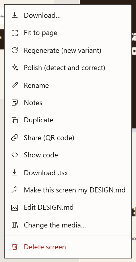
- Download… A document only: PDF with fillable fields, PowerPoint / Google Slides, or PNG images.
- Fit to page A document only: when content runs past a page, measures it and asks the model to win the space back. Kept only if it fits better.
- Regenerate The same prompt again, for a different design.
- Polish Checks the design against named rules and corrects what it finds.
- Notes Private notes on this screen, never sent to a model.
- Share A temporary public link and a QR code.
- Delete screen One confirmation, and it is gone.
| Item | What it does | Cost | |
|---|---|---|---|
Download… | A document only: opens Download the document — PDF with fillable fields, PowerPoint / Google Slides, PNG images. See Documents. | free | |
Fit to page | A document only: measures what runs past the page, asks the model to win it back, measures the answer and keeps it only if it fits better, on the same number of pages. See Documents. | model | |
Regenerate (new variant) | Re-runs the screen's own original prompt for a different result. The previous code is kept, so Revert to the previous version undoes it. | model | |
Polish (detect and correct) | The quality pass: check, correct, check again. See Quality pass. | model | |
Rename | A browser prompt. | free | |
Duplicate | Copies the screen, named {name} (copy), placed by the same rule as any new screen rather than on top of the original. The links are not copied — a duplicate arrives inert, because a hotspot pointing where the original pointed is a flow nobody drew. | free | |
Notes / Notes (N) | Your notes on this screen: add, edit, delete, each dated. Private: never sent to the model (invariant I9) — to make a remark shape the next generation, copy it into the composer. Not carried over by Duplicate. | free | |
Share (QR code) | Creates a temporary public link to this one screen, with a lifetime you choose. A snapshot: editing the screen afterwards does not change what the other person sees. | server | |
Show code | The generated source, read-only. | free | |
Pin as layout reference / Unpin as reference | Makes this screen the layout the next generations imitate. It does not change this screen. | free | |
Download .tsx | Writes the component to a file. | free | |
Revert to the previous version | Only present when there is a previous version. Every rewrite of the code records one — edit, automatic repair, polish, regenerate, add animations, audit fix, and the two free ones, an image swap and an instant text change. One level, and it clears itself: reverting drops the stored version, so the item disappears and there is no redo. | free | |
Make this screen my DESIGN.md | Reads the screen and writes the project's direction from it. Asks for confirmation when a direction already exists. | model | |
Edit DESIGN.md | The full-page editor. | free | |
Change the media… | Lists the images actually present in the code and swaps them, one place or everywhere. Sources: the library, an upload, or a fresh generation. | free / image | |
Delete screen | One confirmation. | free |
The three groups of small buttons#
At the bottom of the menu, three rows that look alike and are not.
Display format — Mobile · Tablet · Desktop · Full. Resizes the
frame and tells later passes what device this is. Full means full height,
fitted to the content. Free: no code is rewritten.
Add animations — Subtle · Moderate · Rich. Rewrites the code to add
motion, keeping content and layout. Costs model, and is revertable.
Play animations — Auto · Yes · No. Decides whether the motion
already in the code runs. Free. Three visible choices rather than one cycling
label, because in a menu a single item that changes wording never shows you what
the other states are.
The middle one spends tokens. The two beside it do not.
The composer#
The floating bar at the bottom. It is the only control in the product that changes verb depending on what is selected.
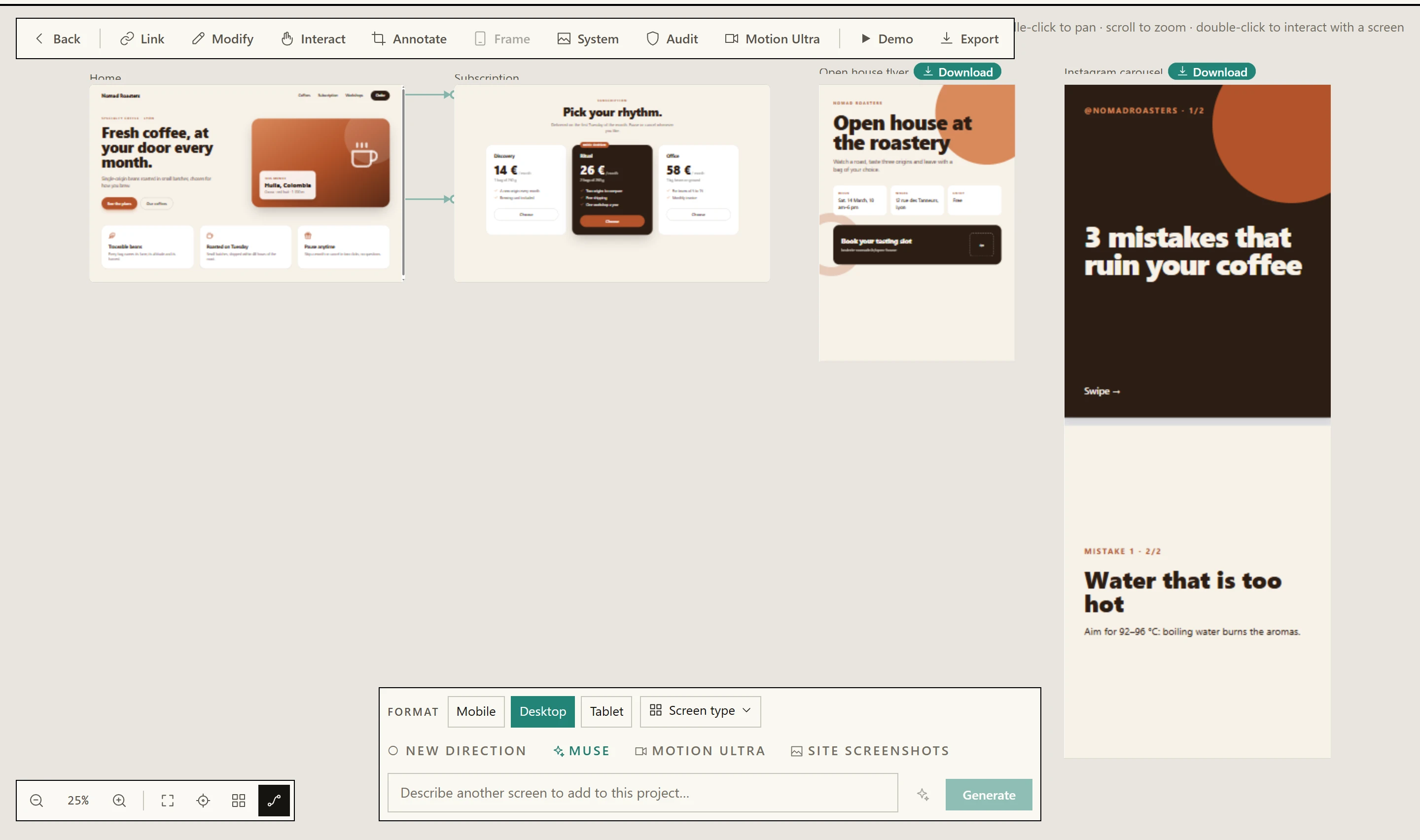
- Format Mobile, Desktop or Tablet for a screen. For a document, the same chips become page formats.
- Screen type The kind of screen or document; its structure guides the generation. It stays armed until you remove it.
- New direction This prompt rewrites the project’s art direction. It unticks itself after the screen.
- Muse Inspiration, an art direction, real copy and pictures for the next screen.
- Motion Ultra A project setting: a storyboard and a series of pictures for each new screen.
- Screenshots of a site Attach screenshots of an existing site to reproduce it or redesign it. They are never stored.
- The prompt Describe the screen.
Ctrl/⌘ + Entersends it. - Improve Rewrites your few words into a complete brief for the chosen format and type.
Back to your textundoes it. - Generate Creates the screen — or
Updatewhen screens are selected.
Screen type opens this menu — a for a screen, or a :
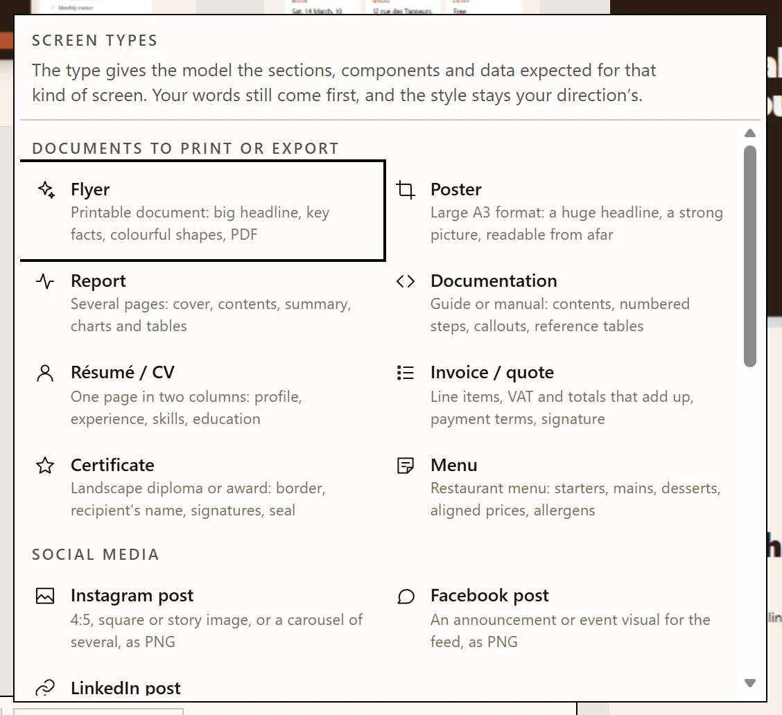
- What a type does It gives the model the structure of that kind of screen. Your words still come first, and the style stays your direction’s.
- Documents to print or export Flyer, poster, report, documentation, résumé, invoice or quote, certificate, menu — fixed pages. See Documents.
- Social media Instagram, Facebook and LinkedIn posts, in the platforms’ own sizes.
- Screens Dashboard, planning, kanban, table, landing page, pricing, product, checkout, sign-in, onboarding, settings, messaging, booking, article, portfolio.
The chips above the field#
| Chip | What it does | Cost | |
|---|---|---|---|
New direction | This prompt writes the project's art direction, which every screen after it follows. It unticks itself once the screen is generated. Hidden while editing a screen — an edit reworks what a direction produced, and letting it rewrite that direction would reattribute every other screen in the project. | free (arms the next generation) | |
Muse | Inspiration, art direction and real copy. Turning it on changes what a generation costs — see Muse. | free (arms the next generation) | |
Format | The viewport preset for the next screen. Only shown when creating, not when editing. With a document type, the same chips become page formats (A4, A3, US Letter, 16:9, or the social sizes). | free | |
Screen type | What kind of screen the next one is — dashboard, planning, kanban, landing page, pricing… — or, under Documents to print or export and Social media, what kind of document. The type's structure guides the generation; your words still win. It stays armed, and a project opens on the type of its latest screen; the ✕ beside it removes it. Ignored in Reproduce. | free (arms the next generation) | |
Picture · No picture / Generated / Free photo | A document only: whether it carries one picture, and where it comes from. No picture composes with shapes and colour. Remembered by the browser. | Generated: the image model's price | |
Motion Ultra | A project setting. Off: one quiet chip, and clicking it switches Motion Ultra on for the project. On: the chip pauses it for the next generations of this session, ×3 / ×6 picks how many pictures each new screen gets (≈ +1 min / ≈ +2–3 min beside it), Video background gives one section a film rendered by your own machine (+1–3 min, off by default), and ✕ switches it off for the project. Hidden while editing. See Motion Ultra. | ×3 or ×6 pictures, one storyboard call, and one film render when the video background is on | |
Images · AI / Free | Where Muse's and Motion Ultra's pictures come from: generated by the image model, or real free photos from Pexels and Pixabay, found from each picture's subject. Shown only when Muse or Motion Ultra is on, the instance has a Pexels or Pixabay key, and the administrator opened free photos to your account. Remembered by the browser. | AI: the image model's price · Free: nothing | |
| The brief | Folds and unfolds the Muse dossier. Shown only when Muse is on and you are creating. Show the full brief / Collapse the brief. | free |
Above those sit the transient rows: numbered annotation thumbnails, each with a
remove button that is visible at rest rather than on hover — hover does not
exist on a phone, and a control that appears only on hover is not hard to find
there, it is unreachable. And, when screens are selected, one chip per screen
with Remove from selection, plus clear.
The field and its two buttons#
| Control | What it does | Cost |
|---|---|---|
| The text field | Describe another screen to add to this project… when nothing is selected; Describe a change to apply to the selected screen… when something is. Ctrl/⌘ + Enter submits. | — |
Generate | Creates a new screen. | model |
Update ({count}) | The same button, when screens are selected: edits those screens instead of creating one. | model |
Stop | Appears while working. Aborts the request. | free |
Improve | Improve the prompt — rewrites what you typed into a complete brief (sections, realistic content, states), for the format and type chosen. The text streams into the field; Stop keeps what you had. Unavailable with site screenshots, which are the brief. | model |
Back to your text | Appears after an improvement: puts your own words back. | free |
Attach screenshots of a site: see below. Screenshots also arrive by pasting into the field or dropping them anywhere on the bar. | free |
That one button doing two jobs is the single most common surprise in Mocky: if
a screen is selected, you are editing it, and there is no new screen coming.
clear next to the chips is the way out.
Screenshots of an existing site#
Attach up to four screenshots of a site that already exists — from the floating bar, or from the welcome card of an empty project — and choose what they are for. A prompt becomes optional — the screenshots are the request; a sentence can still say which page to build or what matters.
| Choice | What the screen takes from the screenshots | What does not run |
|---|---|---|
Reproduce | Everything: the same sections in the same order, the copy transcribed word for word in its own language, the colours as exact hex values, the character of the type, radii and shadows. Pop-ups and banners floating over the page are left out. | Muse, the planner, Motion Ultra and the project's direction — the screenshot is all four. When the project has no direction yet, the reproduced site becomes it, so the next page you ask for belongs to the same site. |
Redesign | The content only: brand, navigation, headings, figures, prices, calls to action. The look is new — the project's direction, or Muse's when it is on — and a result that could be mistaken for the screenshot has failed. | The planner and Motion Ultra, whose job is to invent a structure the site already has. |
Pictures inside a screenshot (photos, illustrations, logos) cannot be lifted
out of it — they are the site's, and they are never stored. What they show
can be: the reading step lists up to six of them (section, subject, shape), and
each gets a replacement from the composer's Images choice — a free photo that
a vision model picks among thumbnails (or refuses them all), or a generated one.
Each lands where the original was. One that finds nothing, and every picture
past the sixth, stays a block of the same size and dominant colour, and a
sentence says how many. A redesign with Muse on takes its pictures from Muse's
dossier instead, so there are never two sets. Logos and icons are drawn as SVG
or text.
A full-page capture is cut, in the browser, into near-screen-shaped parts of
1 280 px wide with a slight overlap, because a 1 440 × 9 000 page shrunk whole to
a model's input size arrives 250 px wide with every line of copy unreadable. The
thumbnail says ×5 when that happened. Eight parts in all per request.
The screenshots are never saved. They leave the browser in the one request
that uses them and nowhere else — no upload, no library, no sync. A screen
remembers that it was built from a site and in which mode, so Regenerate
reuses the screenshots during the same session and, after a reload, says it
needs them again rather than inventing a page from "Reproduce this site".
On a selected screen, attached screenshots are plain references like the annotations: the words say what to take from them. A model without vision is refused up front, with a sentence saying so.
The side panels#
All three open at the same place, on the right, under the toolbar.
Links#
Open with Link. Lists every link in the project, with a count.
| Control | What it does | Cost | |
|---|---|---|---|
Done | Leave link mode. | free | |
From which screen | Which screen to read. The screen is chosen here and not on the canvas, because link mode makes a click inside a frame designate an element rather than the frame. | free | |
Suggest links | Reads the rendered screen and proposes links. Despite the wand, no model is involved: it matches the href the model wrote, and labels that echo another screen's words. The proposal dialog says which of the two reasons applies for every row, and nothing is written until you confirm. | free | |
| A link row | Click to centre the canvas on it. | free | |
Delete link | Removes that one link. | free |
System#
Open with System. Your DESIGN.md's colour tokens, as a palette and a rendered
sample.
| Control | What it does | Cost |
|---|---|---|
| A swatch | Selects the token. The panel then offers a hex field and Apply. | free |
Apply | Rewrites that one token in DESIGN.md. Every future generation follows the change; nothing already on the canvas moves. | free |
Edit | Open the full DESIGN.md editor. | free |
Audit#
Open with Audit. One screen at a time, chosen from thumbnails — thumbnails
already captured, never taken here, because a capture needs a same-origin iframe
and running model-written code on Mocky's own origin is not something a panel
should do as a side effect of opening.
| Control | What it does | Cost |
|---|---|---|
| A thumbnail | Picks the screen, and frames it on the canvas so the report is about something you can see. | free |
Evaluate / Evaluate again | Runs the deterministic rules over an AST, in the browser. Works with the backend down. | free |
Deep analysis (checkbox) | Adds the questions a rule cannot settle — does the alt describe the picture, does the heading describe its section. Off by default. | model, when the evaluation runs |
Fix | Corrects one finding. | model |
Fix all | Corrects every enforceable finding. | model |
Two things the panel says out loud rather than in a tooltip.
Source-only analysis: the score is about markup and what classes declare,
so a 100 does not mean "conformant". And a family row can read not applicable or
not measured instead of a number — a screen with no form and a screen whose
forms are perfect produce the same empty finding list, and only one of them has
earned a score.
Findings marked Advisory — not corrected automatically have no Fix button by
design; they are judgement calls the correction pass is not allowed to spend an
iteration on.
The last block, Exported document, is not about the chosen screen at all. It
is computed once for the project and repeated under every screen, because a
Mocky screen is a component: it has no title, no language and no description,
and those three exist only in the HTML the export writes. Nothing there has a
Fix button either — the fault, when there is one, is in the project's name or
in its product name, not in any screen's markup.
The Motion Ultra panel#
Open with Motion Ultra. A film for a screen. The ordinary answer is composed: a
model builds each scene out of a catalogue of typed blocks over a ground that can
move, and five ready-made compositions stay reachable by name — a slideshow, a
banded screenshot, a phone-shaped cut, animated titling, a product spotlight.
The render runs on the Remotion worker, not in this browser — and that worker
is a separate, opt-in Docker service, so the first thing the panel does is say
whether it is there. Why it is built that way is in Motion Ultra.
No film is made on its own. There are two ways to get one: Motion Ultra's
Video background, which gives one section of each new screen a film rendered
for it, and this panel, where you cut one by hand, revise one, or ask for
another. (The composer's animation switch, which used to make a film for every
screen when set to "forced", is gone: page animations are always on, and a
screen is held still from its own menu.)
The feature was called "Video export" and the file names still are. That is
deliberate and explained on the page above: what a user reads says Motion Ultra, what a
developer greps says video.
An account the feature is not enabled for gets one terse sentence and nothing else: it learns nothing about how the instance is configured, nor about what a valid cut looks like.
The first control is Composition, and its default is Automatic. Six
cards: automatic, then the five compositions, each with its name, one sentence
saying what it makes, one saying what it requires, and its own bounds. The
third line is the one that decides the choice — "animated titling" does not say
that it uses no picture at all, and somebody who has just spent a minute
choosing images should learn that before the click rather than after it.
Automatic is the default rather than an option further down the page, because it is the position that serves a brief best: the model reads your sentence and takes the composition built for it. On automatic there is nothing to render yet — the selection is what the model is given to work from — so the render button names that as the reason it will not fire, and a proposal is what decides the composition. The selector then moves to whatever came back.
Choosing one by hand changes the form under it, which is the point of
choosing: a composition that uses no image shows no image picker and an
Add a card button instead; a product spotlight shows a headline, three
argument boxes and a call to action; a banded screenshot shows a band title and
where the band sits, and no camera move at all, because a pan across a
screenshot slides half the interface out of frame. Switching composition keeps
your pictures and your words — nothing is dropped, and a scene count over the new
composition's ceiling is reported so you can remove rows yourself.
There is one form, and two ways to fill it in — behind a switch, one visible at a time. Stacked, the two of them filled a 900-pixel window on their own, so the scenes, the running total and the render button all started below the fold on a panel nobody had touched yet. They are alternatives, not steps, and two open forms said the opposite. Which one you last used survives inside the open panel and is not remembered afterwards: it is a fact about the cut you are making now.
| Control | What it does | Cost |
|---|---|---|
Composition | Which of the five kinds of film this is, or Automatic — the default, where the model picks. Chosen by hand, it decides the fields of everything below. | free |
Describe the video → Propose a cut | Sends your sentence and the images you already picked to the model. On Automatic it picks one composition out of the five and fills it in; on one you chose, it holds to it, and a proposal naming another is refused rather than loaded. Either way it does not choose the pictures and cannot add any. | model |
Start from an image → Generate a model image | Makes one picture from a subject you describe. Nothing continues until you Keep, Regenerate or Abandon it. | image |
Or start from a picture in the media library | The same picker the scene list uses. A library image already exists and you just looked at it to pick it, so it goes straight to the variants with no first confirmation. | free |
Produce {n} variants | Two to six takes on that picture, shown small above the button so you can see what they will derive from. Then you tick the ones worth cutting; anything left unticked stays pending, for good. | image, one call per variant |
| A scene row | The chosen composition's own fields, and none of the others: always a duration and a transition, then a camera move and a caption on a slideshow or a phone cut, a band on a screenshot, a headline and an entrance on a title card, a headline with up to three arguments and a call to action on a product. Move up, move down, remove. On Automatic a row is the picture and its place in the running order, because the composition that would read a setting is not decided yet. | free |
Output | Aspect ratio (16:9, 9:16, 1:1) and container (mp4, webm). A phone-shaped cut has no ratio to choose: 9:16 is the composition, and the panel says so instead of offering two values that would refuse the document. | free |
Start the render | Queues the job. One render at a time on the instance; you can close the panel and find it again on reopening. | server (minutes of CPU) |
Download the video | The finished file. | free |
A proposal is a pre-fill, not a mode. What comes back is written into the same controls, all of them still live, and replacing a cut you arranged by hand asks first. A read-only preview would have to be taken whole or thrown away whole, and the first thing anyone wants to do with a proposed running order is move two scenes. The switch is about which assistant is on screen; neither of them is a state the timeline is in, and switching away loses nothing — a brief you typed, a picture you have not confirmed and a call still in flight all survive it.
Four things the panel states rather than implies, because each is a fact about your instance that changes what you get:
- Where the colours and the typefaces come from. They come from the project's art direction, they are shown under the composition cards — the swatches and the family names — and there is no control here to change them. Saying nothing would invite the opposite reading, that a colour setting waits further down; there is none, and there cannot be, because the schema a composed document is validated against has no theme key at all. Only what the direction actually states travels: a project whose accent was inferred rather than written shows no accent, and the composition uses its own default. With no direction, the panel says that instead.
- Whether the variants will really derive from your picture. With an
Editimage profile configured they come out of an image-to-image model fed with your own image; without one they are born of the same text — same subject, another photograph. The sentence appears twice: before the click, from what the server promises, and afterwards, from what the answer actually did. {used} s of {max} s. Two minutes total, twenty scenes, and the button names the reason it will not fire rather than sitting there greyed out.Last scene: this transition never plays.The field is on every scene because the schema is uniform. Hiding the control would give one row a different shape from the others for no visible reason the moment anything is reordered.
When a render fails, the banner is a heading and a next step, never "the export
failed". Four situations arrive as the same kind of error and send you somewhere
completely different: the volume is full (shorten nothing — ask the
administrator), the worker is unreachable (an instance setting, not your cut),
the pictures left the library (replace those scenes), the render stopped
answering (reopen the panel; it may have finished anyway). A fifth is not a
failure at all — Some images are awaiting your confirmation means the server
refused a picture nobody has looked at, which is the whole reason that guard is
on the server and not in this panel.
Where the finished file goes, and the panel says it rather than leaving a
download link that disappears with it: Media, under the Motion Ultra tab —
attached to the project you cut it in, or to no project at all when you cut it
from the standalone Media page. That tab carries the name of the feature, not of
the object, because it is where the panel sends you and the two have to read the
same. The object itself is a cut, the word this panel already uses in
Propose a cut and New cut; a scroll sequence in the Videos tab is a
sequence, and calling both of them a video is what made an export impossible to
find in the first place.
Demo mode#
Demo plays the prototype full screen: click the linked areas to follow a flow,
Back and Restart walk the history. The bar also switches screens without the
links — Previous screen, the Go to a screen list, Next screen, or ← → — and
each step counts as a followed link, so Back still works.
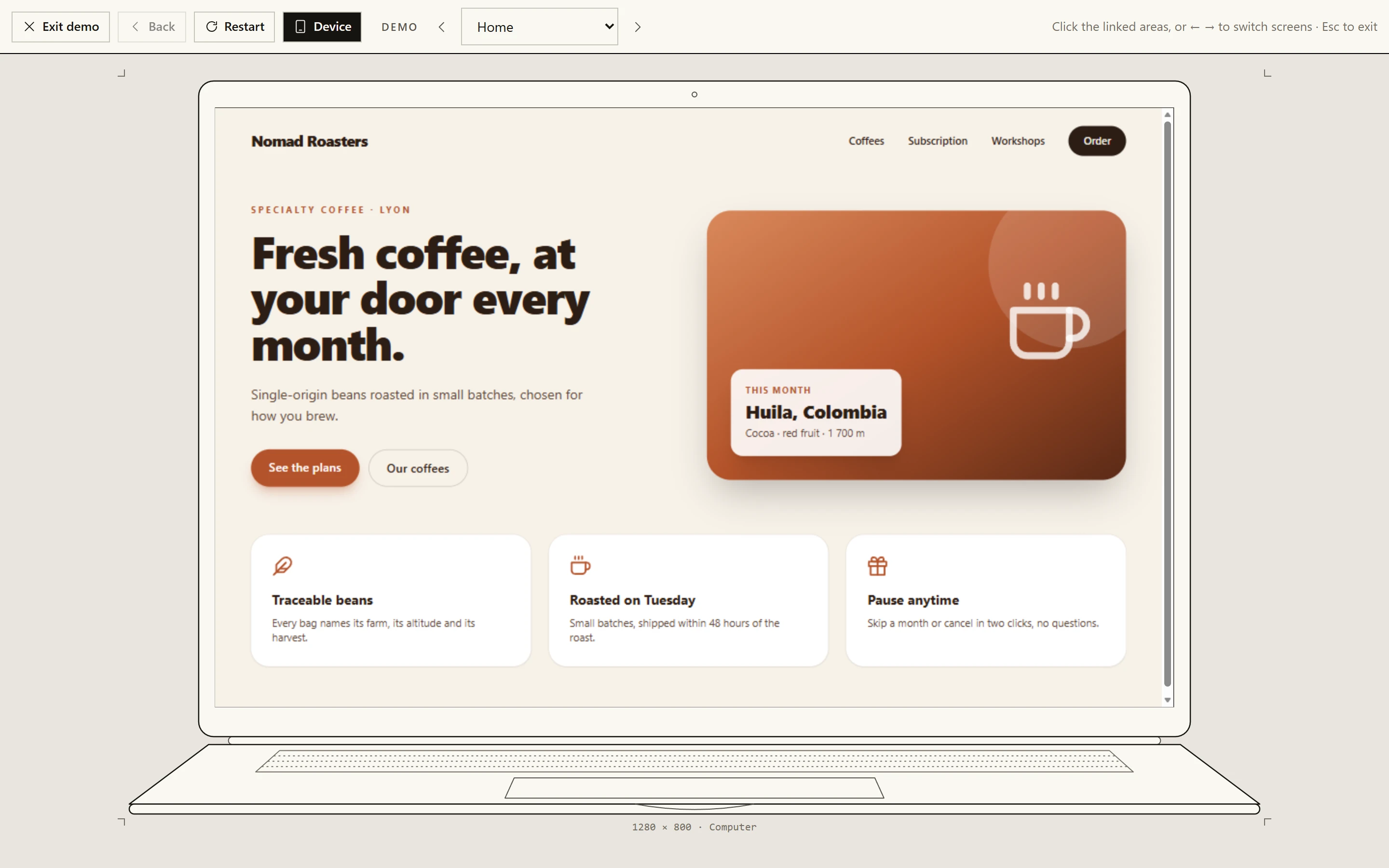
Esc does the same.- Exit demo Back to the canvas.
Escdoes the same. - Back The previous screen of the path you followed.
- Restart Back to the first screen.
- Device The line-drawn frame: a computer, a tablet or a phone by the screen’s size; a hand for a printed document, a phone feed for a post.
- Screen switcher Previous, a list of every screen, next — or ← →. Each step counts as a followed link.
- The screen Live and clickable: the linked elements take you to their screens.
- Caption The size the screen was designed at, and the device it was given.
Device puts the screen in a line drawing of where it will be seen,
chosen from its size — a computer, a tablet or a smartphone, in the interface's
own ink. A document gets its own frame: a printed page is held in a drawn hand,
and a social post is shown on a phone, in its feed or as a full-screen story (see
Documents). A presentation has none, so the button
is off there. The choice is remembered by the browser.
The modals#
Everything that opens over the canvas. The first is a dropdown rather than a dialog, and it is listed here because it is where the export decision is actually made.
| Modal | Opened by | What is worth knowing | Cost |
|---|---|---|---|
Runnable project (.zip) | Export | Three stacks: shadcn-ready, Plain Tailwind, daisyUI. The zip is built in the browser and the exported HTML carries the interface language, which is what makes an exported French page readable aloud. | free |
Link → which screen? | Clicking an element in link mode | Picks the destination. Cancel leaves nothing behind. | free |
Element | Clicking an element in modify mode | See below — it holds three different costs in one card. | mixed |
Code | Show code | Read-only. | free |
Download the document | A document's Download pill, or Download… in its menu | Three buttons — PDF, .pptx, PNG — and a Save “{file}” link once the file is ready, because a browser may block a second automatic download. What could not be exported perfectly is listed under it. See Documents. | free |
Share this screen | Share (QR code) | A lifetime of 1 hour, 24 hours or 7 days, a QR code, and Revoke. | server |
Media in “{name}” | Change the media… | Two sections, never one list. Images in the screen’s code: per image, Replace, or Everywhere ({n}) when the same file appears several times, or one slot at a time — this rewrites the source, and Revert undoes it. Media attached to the screen (not in the code): a cut or a sequence to hang on the canvas card, and Detach — this leaves the code alone. Upload a file is free; Generate calls the image provider. | free / image |
The Element card, opened by clicking something in Modify mode, is the one
place where three costs sit in one dialog:
Text→Update— free when the text you typed is a unique verbatim match in the source, in which case it is a string substitution and lands instantly. When it is ambiguous, it silently falls through to a model edit.Recolorswatches — each one is a model edit of that element. They are one tap, which is exactly why they are worth flagging: a swatch that costs tokens looks identical to a swatch that does not, and the panel next door has swatches that do not.Or describe any change→Apply change— a targeted model edit. Ctrl/⌘ + Enter submits.
The note at the bottom of that card says the same thing in one line: text changes apply instantly when they are unique, other changes go through the model, everything is revertable from the screen menu.
Controls you will confuse#
This, not that#
| This | Not this | The difference |
|---|---|---|
Interact (toolbar) | Double-clicking one screen | The toolbar button makes every preview clickable at once. The double-click makes exactly one, and that one wears an Interactive — click outside to leave badge. |
Add animations (context menu) | Play animations (context menu) | The first rewrites the code to add motion — a model call, revertable. The second only decides whether motion that is already there runs. They sit two rows apart in the same menu. |
Use this design (beside a frame) | Make this screen my DESIGN.md (context menu) | The first restores a recorded document, exactly, for free. The second asks a model to read the screen and write a new one. Same intent, opposite mechanism, and only one of them costs anything. |
Apply in the System panel | A Recolor swatch in the Element card | The System panel rewrites a token in DESIGN.md: free, and it changes future generations only. The Element swatch is a model edit of this element, right now, and leaves DESIGN.md alone. |
Pin as layout reference | Use this design | The pin governs layout for the next screens. The design card governs the art direction. A screen can be one, the other, both or neither. |
System | Edit DESIGN.md | Same icon, two depths: the panel shows the tokens and recolours them; the page is the document itself. Edit inside the panel is the bridge. |
Regenerate (new variant) | Polish (detect and correct) | The first throws the screen away and asks again from the same prompt: a different design. The second keeps the design and fixes named defects in it. |
Audit findings | Polish (detect and correct) findings | Two catalogues, two scores, two correction prompts. One is about markup, the other about taste. Neither one's score appears in the other's field. |
Generate | Update ({count}) | The same button. If a screen is selected you are editing, not creating. |
Fit to page | Polish (detect and correct) | Both rewrite a document and keep the design. The first answers one measured problem — content past the page — and only tightens; the second answers a list of design findings. |
Tick all | "select every project" | It ticks the visible projects. Under a search, that is the search result. |
Suggest links | Anything AI-shaped | Deterministic. It reads what is already in the rendered screen; it does not ask a model to imagine a flow. |
| Theme button | The current theme | The icon is where you are going, not where you are. |
Two screens are selected, and you press the composer's main button. What happens?
With a selection, the button reads Update (2) and edits those screens. clear, beside the chips, empties the selection so the next prompt creates a screen.
Not quite. Try again.
The four correction passes#
Mocky can rewrite a screen for four different reasons, and the four are not interchangeable. Merging them is the tempting refactor, and it breaks all of them.
| Repair | Polish (detect and correct) | Fix / Fix all | Fit to page | |
|---|---|---|---|---|
| Where | Nowhere — no button | Screen context menu | The Audit panel | A document's context menu |
| Trigger | The preview iframe reports a render or compile error | You ask for it | You ask for it | You ask for it |
| What it is told | Fix only the error, do not restyle | Fix these named findings, change nothing else | Fix the markup; the screen must look identical afterwards | Win back these measured pixels; same design, same pages |
| Budget | 2 attempts | 2 iterations | 2 iterations | 1 call per click, measured before and after |
| Cost | model, automatic | model | model | model |
Read the middle row again: each instruction is fatal to the others.
- A slop finding is a styling problem. Hand it to a model told not to restyle and it returns the screen unchanged, having obeyed.
- An accessibility fix that restyles has failed even when every finding is gone, because a semantics correction came back as a redesign.
- And a repair that felt free to restyle would answer a compile error with a new design, which is not what anyone asked for while looking at a broken screen.
What they do share is the transport and the write-back conventions — an abort
controller, a snapshot of the code checked again before writing, and a previous
version so Revert to the previous version works — and the first three share the
loop with its four stop conditions. That loop is
runPolishLoop, and it is generic over its report type for exactly this reason:
the stopping rules are worth having once, and the checks that feed them are not
the same check. Fit to page measures progress in pixels rather than in rule
ids, so it keeps its own single step.
Everything that spends tokens#
Nothing in Mocky calls a model on its own. Every entry below is a click, and this is the complete list.
| Control | Where | Note |
|---|---|---|
Generate | Composer | With Muse on, the one click also runs the inspiration pass and may call the image provider. With Motion Ultra on, it also runs a storyboard call and generates ×3 or ×6 pictures — and, with Video background, composes one film (a text call) and renders it on the worker. |
Update ({count}) | Composer | One call per selected screen. |
Improve | Composer | One call that rewrites your prompt; nothing is generated until you press Generate. |
| Repair | Automatic, after a failed render | The only unprompted model call — and it only happens after a generation you asked for produced code that will not run. Capped at two attempts. |
Regenerate (new variant) | Screen context menu | |
Polish (detect and correct) | Screen context menu | The check itself calls a model for the rules a regex cannot settle, then up to two corrections. |
Add animations — Subtle / Moderate / Rich | Screen context menu | |
Fit to page | A document's context menu | One call, and two off-screen renders to measure before and after. |
Make this screen my DESIGN.md | Screen context menu | |
Derive a DESIGN.md | Design card beside a frame | |
Text → Update | Element card | Only when the text is not a unique verbatim match. Otherwise free and instant. |
Recolor swatches, custom hex → Go | Element card | Every swatch is a model edit. |
Apply change | Element card | |
Deep analysis | Audit panel | Changes what Evaluate costs. Off by default. |
Fix / Fix all | Audit panel | |
Generate (an image) | Change the media…, image library | Calls the image provider, not the text model. |
Picture · Generated | Composer, on a document | One picture from the image provider for the next document. |
Propose a cut | Motion Ultra panel | The only model call in Motion Ultra. It picks a composition and cuts the images you picked; it never picks one of the pictures. |
Generate a model image, Produce {n} variants | Motion Ultra panel | The image provider, once per picture. Six variants is six calls. |
Start the render | Motion Ultra panel | No model and no provider — but minutes of CPU on the render worker, which is the most expensive click in the product on a small box. |
And the notable absences — things that look expensive and are not:
Evaluate in the audit panel with Deep analysis off, Suggest links, Use this design, Export,
Download .tsx, a document's Download (the PDF, the .pptx and the PNGs are all built in your browser), Duplicate, Arrange, the whole System panel, opening the
Motion Ultra panel, and every format, frame and playback toggle in the product.
Thanks for your feedback!