
Documents and social posts
Flyers, reports, résumés and social media posts — fixed pages you download as a PDF, a deck or images.
Most of what Mocky makes is a screen: a page of an app or a site, laid out for a viewport and meant to be clicked. A document is the other kind of thing it can make — a flyer, a report, a résumé, an Instagram carousel — and it is not a screen at a different width. It is a stack of pages of a fixed size, composed one by one like a sheet in a layout program, and it leaves Mocky as a file: a PDF, a PowerPoint deck, or images.
This page covers what changes when the thing you are making is a document, and the three things you can only do with one: download it, fit it to its page, and see it held in a hand or posted in a feed.
Why it works this way
A document built as a web page fails in ways nobody sees until it is printed: a "flyer" laid out at 1 440 px wide is a landing page with the word flyer in its title, and a report that scrolls has no page breaks to put in a PDF. Fixing the page size first is what makes three things agree — what the canvas shows, what the file contains, and where a fillable field lands in it.
Making one#
Pick a typeDone
In the composer, open
Screen typeand choose one fromDocuments to print or exportorSocial media.Check the formatDone
The
Mobile/Desktop/Tabletchips are replaced by page formats, with the type's own format selected. Pick another if you need it.Choose the pictureDone
A document offers
Picture:No picture(shapes and colour only),Generated(one picture from the image model) orFree photo(one real photo from Pexels or Pixabay, when the instance has a key).Describe it and generateDone
An empty field is filled with an example for the type; your own words are never replaced.
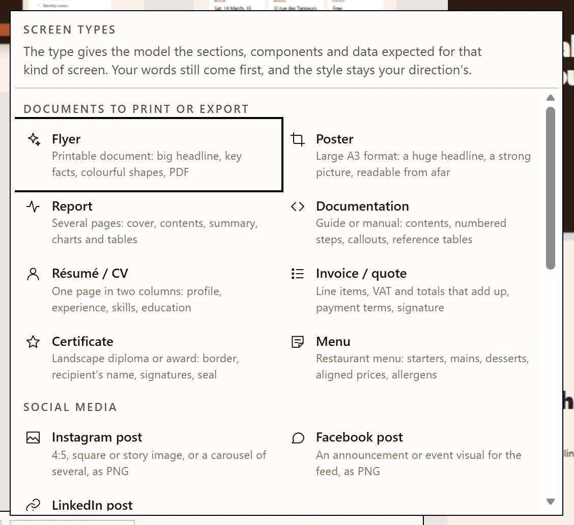
- What a type does It gives the model the structure of that kind of screen. Your words still come first, and the style stays your direction’s.
- Documents to print or export Flyer, poster, report, documentation, résumé, invoice or quote, certificate, menu — fixed pages. See Documents.
- Social media Instagram, Facebook and LinkedIn posts, in the platforms’ own sizes.
- Screens Dashboard, planning, kanban, table, landing page, pricing, product, checkout, sign-in, onboarding, settings, messaging, booking, article, portfolio.
The type stays armed after the generation, and a project opens on the type and
format of its latest screen: the next request in a project of flyers is a flyer
too, not a web page. The ✕ beside the chip (Remove the screen type) goes back to
screens, and that choice is remembered the same way.
A document skips what only makes sense for a screen: the planner, Motion Ultra, the scroll video and every animation — a page is printed at rest. Muse and the project's direction still apply, so a flyer looks like the rest of the project.
The types#
Each type gives the model the structure of that kind of piece. Your words win on any conflict, and the look stays your direction's.
| Type | Starts on | What it asks for |
|---|---|---|
Flyer | A4 | One striking page: a huge headline, the key facts (date, place, price) as their own block, highlights, a call to action printed as words beside a QR-code placeholder, colourful shapes bleeding off the edges. A tear-off coupon of fields only when the request is a sign-up. |
Poster | A3 | One page read from three metres away: one dominant element, the essential facts in one block, no body text. |
Report | A4 | A cover, a contents block, an executive summary of key figures, body pages with numbered sections, charts and a table, running headers and page numbers. Figures consistent from page to page. |
Documentation | A4 | A title page with a version, a table of contents, numbered sections, procedures as numbered steps, note / tip / warning callouts, a reference table. |
Résumé / CV | A4 | One page in two columns: profile, experience with achievements, education, skills, languages. Sober and legible. |
Invoice / quote | A4 | The issuer, the client, a line-item table with VAT, totals that add up exactly, payment terms. A quote gets an acceptance block made of fillable fields. |
Certificate | A4 landscape | A decorative border, the recipient's name as the most prominent text, signatures and a seal. Name and date become fields when you ask for a blank template. |
Menu | A4 | Starters, mains, desserts and drinks, prices aligned, dietary markers with a legend, one framed special. |
Instagram post | 4:5 | One big idea per image; a carousel when there is more to say (the first image is the hook, the last the call to action). |
Facebook post | 1.91:1 | The visual of an announcement or an event, little text — the post's own text carries the detail. |
LinkedIn post | 1:1 | A professional insight or result; a carousel exported as a PDF is LinkedIn's document post. |
Page formats#
The format chips show only the formats of the type's family: paper and slides for a document, social sizes for a post. A post laid out for a phone is not the same piece at A4, so the composer never offers the jump — and a format picked for a report does not follow you to the Instagram post typed next.
| Family | Format | Page size |
|---|---|---|
| Paper | A4 · A4 landscape | 794 × 1 123 px (210 × 297 mm), and turned |
| Paper | A3 | 1 123 × 1 587 px (297 × 420 mm) |
| Paper | US Letter · US landscape | 816 × 1 056 px (8.5 × 11 in), and turned |
| Paper | Presentation 16:9 | 1 280 × 720 px — PowerPoint's and Google Slides' "Widescreen" |
| Social | Square 1:1 | 1 080 × 1 080 px |
| Social | Portrait 4:5 | 1 080 × 1 350 px, the tallest a feed shows whole |
| Social | Story 9:16 | 1 080 × 1 920 px |
| Social | Landscape 1.91:1 | 1 200 × 628 px, a shared link, Facebook, LinkedIn |
Paper sizes are in CSS pixels at 96 per inch, which map exactly to PDF points, so a page exports at its real paper size. Social sizes are the platforms' own pixels, so the exported image is the file they ask for, as it is.
The model is told the margins that must stay clear: 40 px on paper, past what an office printer cannot reach; 64 px on a post; and on a story, the top and bottom bands where the app draws its own bars.
Fields#
A blank someone fills in — a name, a date, a box to tick, a choice — is a field, not a drawn line. On the canvas it looks like the rest of the design; in the exported PDF it becomes a real form field, fillable in any PDF reader. Two fields with the same name on a recto-verso are renamed so both keep their own value.
The social types ask for none: nobody fills in an Instagram post.
Downloading#
A document's frame carries a Download pill, and the screen context menu a
Download… item. Both open Download the document, with three buttons:
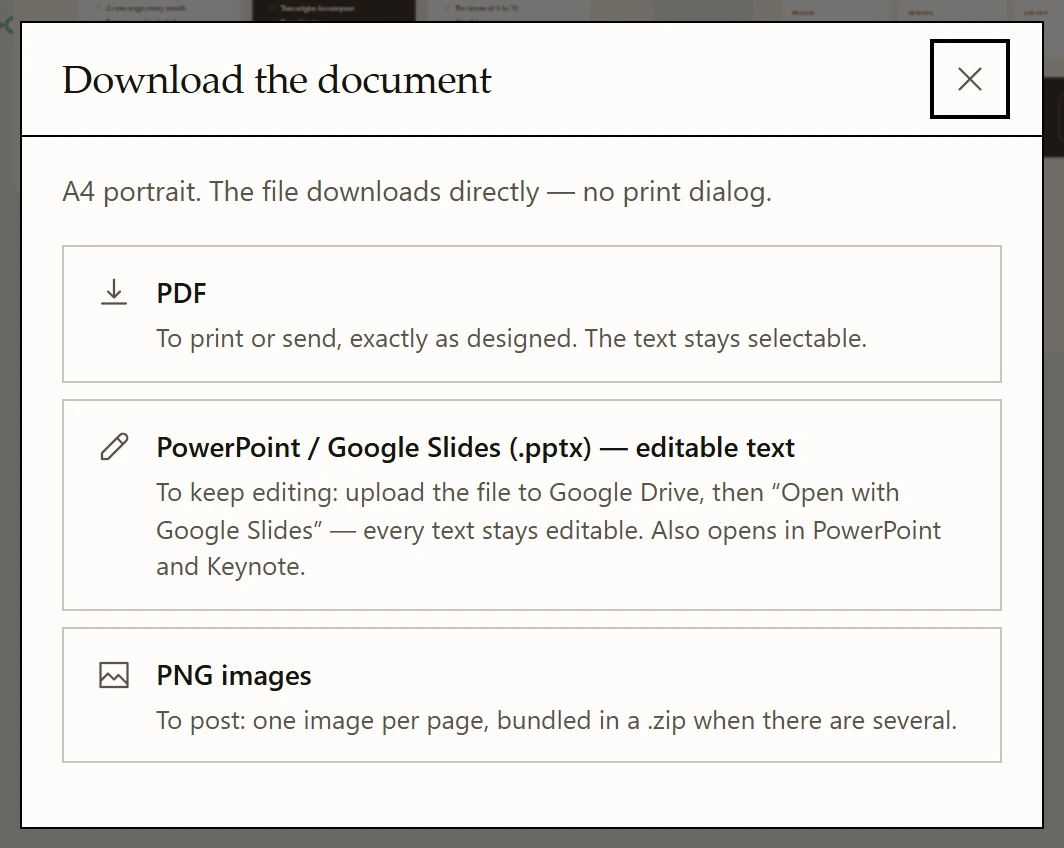
- The format The page format the document was laid out in. The file downloads directly — no print dialog.
- PDF To print or send. Text stays selectable; every field becomes a real form field.
- PowerPoint / Google Slides To keep editing: the design as a picture, every text as an editable box. Open it in Google Slides from Drive.
- PNG images To post: one image per page, in a
.zipwhen there are several. A social post comes out at its exact pixels.
| Button | What you get | For |
|---|---|---|
PDF / PDF — fillable fields | The pages as drawn — at print resolution for paper, at its own pixels for a post — with the text still selectable and every field fillable. | Printing, sending. |
PowerPoint / Google Slides (.pptx) — editable text | One slide per page: the design as a picture, and every run of text as an editable text box over it. Upload it to Google Drive and choose "Open with Google Slides". | Keeping on editing. |
PNG images | One image per page, in a .zip when there are several. A social post comes out at exactly its format's pixels. | Posting. |
The file is built in your browser, page by page, and downloads by itself. A
Save “{file}” link stays in the dialog, because a browser may block a second
automatic download from the same page.
When something could not be exported perfectly, the dialog says so under the link rather than hiding it: content cut at the page edge, rotated text left in the picture of a slide, a page drawn by the fallback renderer, a picture or font that could not be embedded.
When content runs past the page#
A page has one size, and the model writes it without seeing it rendered: it can guess a height and guess it long. When text or a field ends up past a page's edge, Mocky says so — a notice names the document and the page — because on paper that content is simply cut.
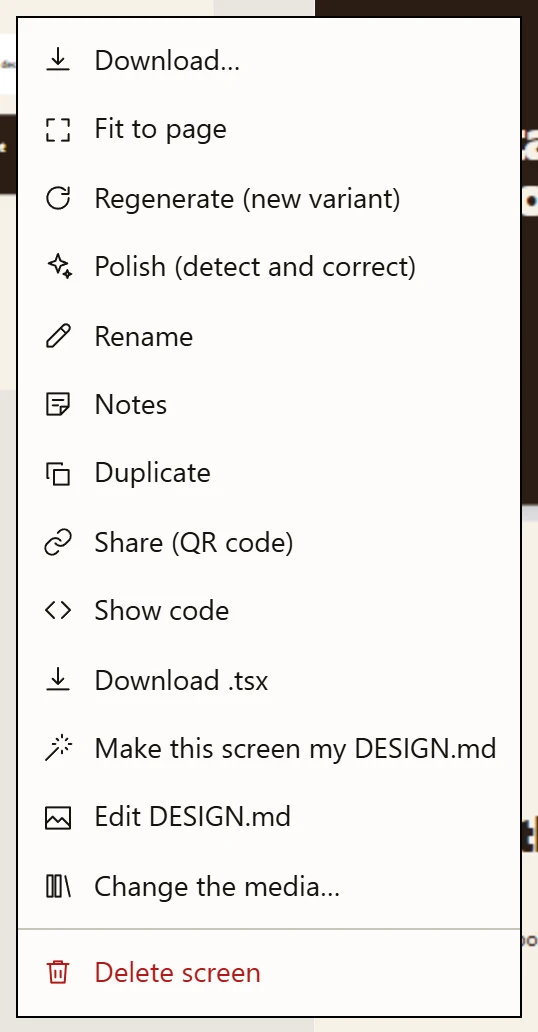
- Download… A document only: PDF with fillable fields, PowerPoint / Google Slides, or PNG images.
- Fit to page A document only: when content runs past a page, measures it and asks the model to win the space back. Kept only if it fits better.
- Regenerate The same prompt again, for a different design.
- Polish Checks the design against named rules and corrects what it finds.
- Notes Private notes on this screen, never sent to a model.
- Share A temporary public link and a QR code.
- Delete screen One confirmation, and it is gone.
Right-click the document → Fit to page asks the model to win the space
back. It is not an edit and not a polish:
- The document is rendered off screen and measured the way the export reads it: how many pixels past which edge, and which words are outside.
- The model gets those numbers and a strict instruction — tighten spacing, then pictures, then oversized type; keep every section, the copy, the palette and the number of pages.
- The answer is rendered and measured again before anything is written.
| Result | What happens |
|---|---|
| Everything fits | The new version replaces the old one. Revert to the previous version undoes it. |
| Closer, still over | The new version is kept, and the notice gives what is left, in pixels. You can fit it again. |
| No better, worse, or a different number of pages | Nothing changes, and the notice says so. |
One model call per click, never retried on its own. Adding a page is a different document, so it is left to you: ask for it in the composer.
You run Fit to page, and the model's answer only fits by adding a second page. What does Mocky do?
A different number of pages is a different document, so the answer is rejected however well it fits. Ask for a second page in the composer if that is what you want.
Not quite. Try again.
Social posts#
A post is one image or a carousel of several: each PNG images download
gives them numbered, at the platform's size; for LinkedIn, the PDF download is a
ready-made document post.
A story is sized 9:16, and the model keeps text out of the bands the app covers at the top (progress, name) and at the bottom (reply field).
In demo mode#
With Device on, the demo shows a document the way it will be seen:
- A printed document is held in a hand, drawn in the same line as the device frames, one page at a time with a pager under it.
- A social post is shown on a phone, in its feed: an author row, the picture at the full width of the screen, the actions and the caption — under the picture on Instagram, above it on Facebook and LinkedIn — and the next post starting. A carousel shows its counter and its dots; the arrows under the phone turn the pages.
- A story fills the phone's screen, with its progress segments and the reply field.
- A presentation has no frame: it is projected, not held.
A flyer, held:

- Device On for a printed document: it is held in a hand, drawn in the same line as the devices.
- The page The real document, one page at a time; a pager appears under it when there are several.
- The hand Only the thumb lies on the sheet, along its edge; the rest of the page stays clickable.
- Caption The page format.
A carousel, in its feed:
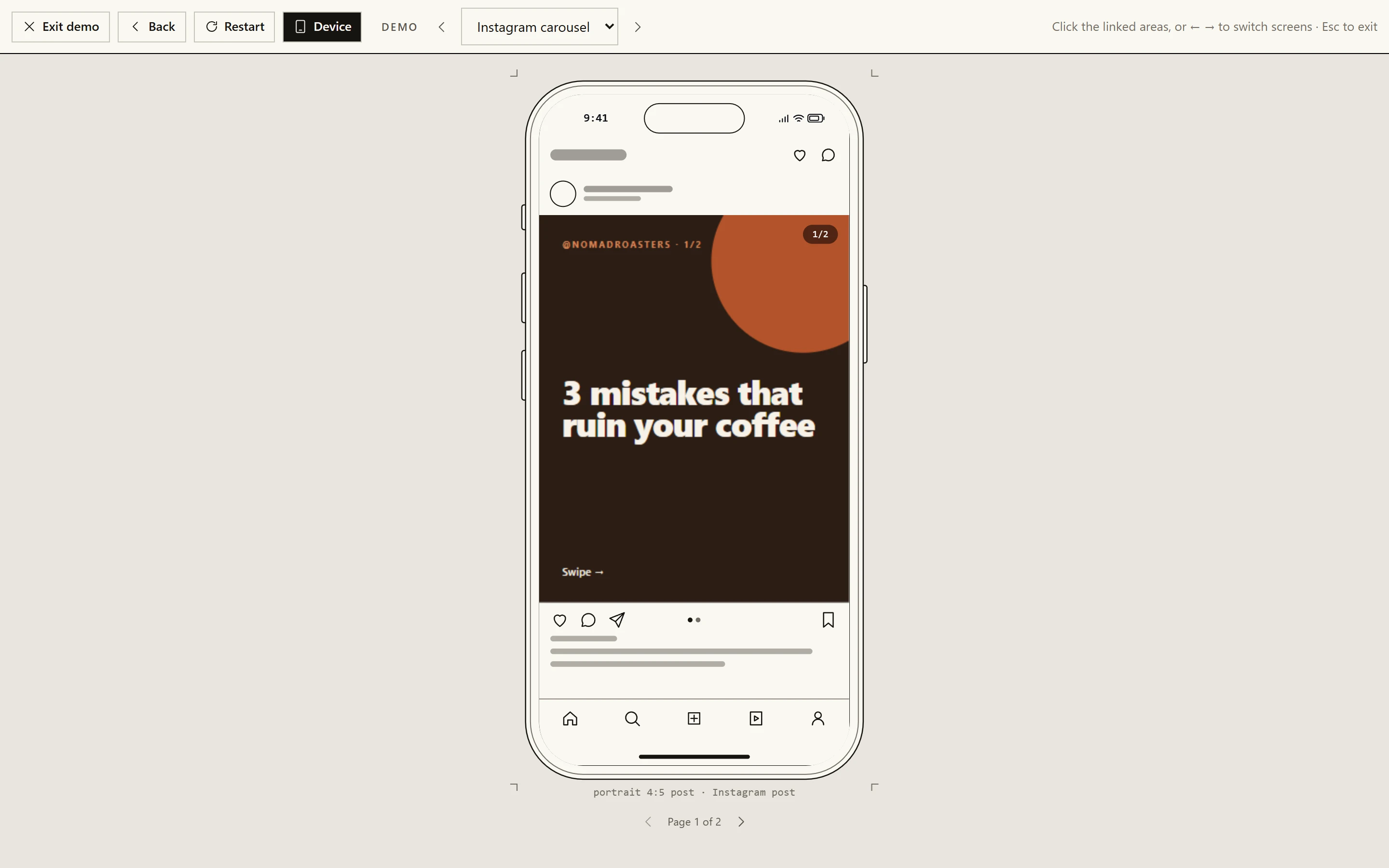
- Author row The feed drawn around the post: generic, in the phone’s ink — no logo, no copied interface.
- The post At the full width of the screen, where the platform puts it.
- Carousel counter The page shown and the carousel’s length.
- Actions and caption Under the picture on Instagram; above it on Facebook and LinkedIn.
- Pages Turns the carousel’s pages. A story fills the screen instead.
The drawn app is deliberately generic — no logo, no copied interface. It says where the picture will live and leaves the eye on the picture.
Thanks for your feedback!